
Inkora
Objective of This Design
Inkora is a digital library app designed with users like Ava Solis in mind — a college student and avid reader who wanted a calming, visually appealing browsing experience without the clutter. Ava needed an intuitive interface that made discovering new books effortless, with personalized recommendations and a smooth, stress-free layout. The goal was to design a platform that felt personal, organized, and easy to explore — meeting the needs of readers who value both aesthetics and functionality.
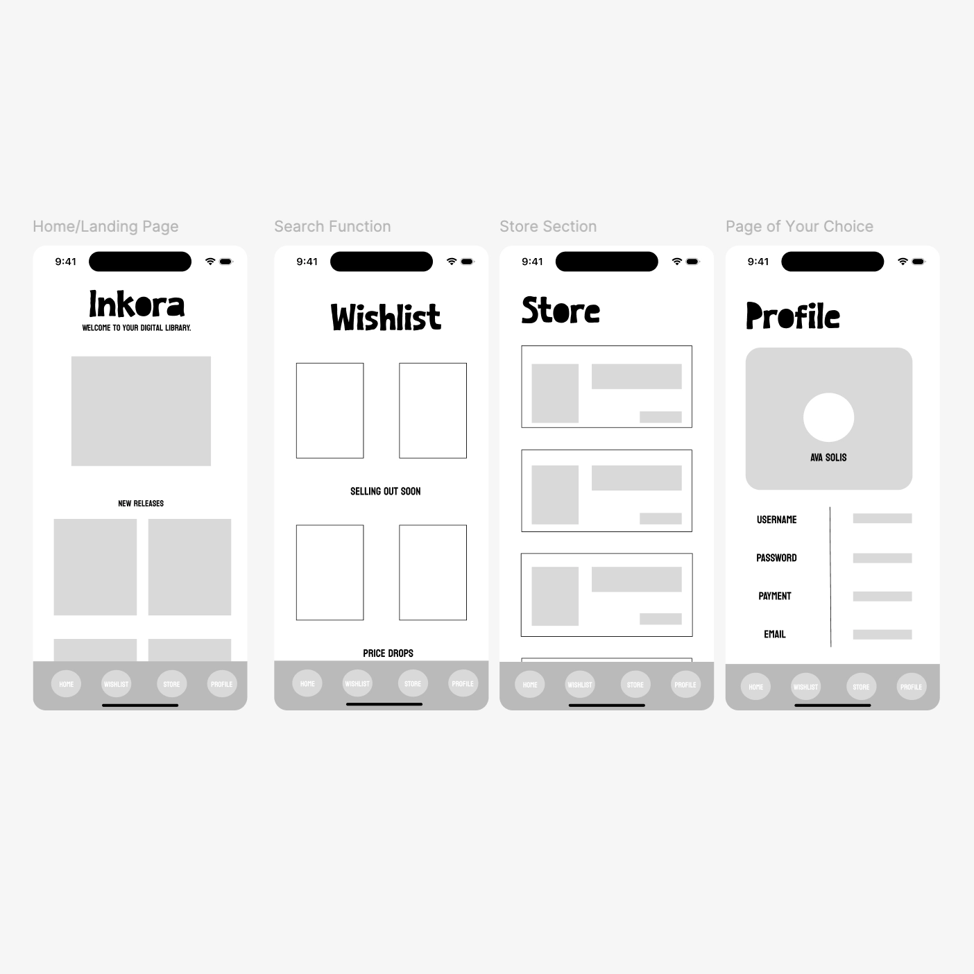
Low Fidelity
Starting out, I designed low fidelity wireframes in Figma to establish the basic structure and layout of Inkora before any visual design decisions were made. These wireframes map out the four core screens — the Home/Landing Page, Wishlist, Store, and Profile — focusing on content hierarchy and user flow without the distraction of color or typography.
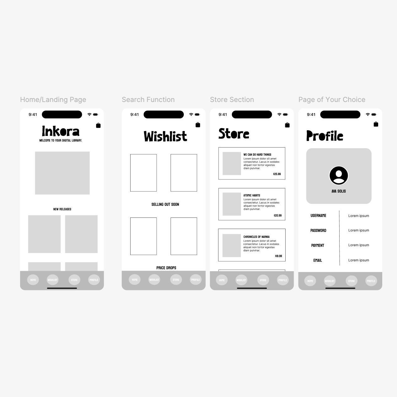
Medium Fidelity
Building on the low fidelity wireframes, the medium fidelity stage added more detail and realistic content to each screen. Navigation menu options were added to the bottom of each screen, book titles and prices were placed within their respective cards, and the Profile page was further developed with placeholder account information. This stage brought the design closer to a real product while still focusing on layout and functionality over final visuals.
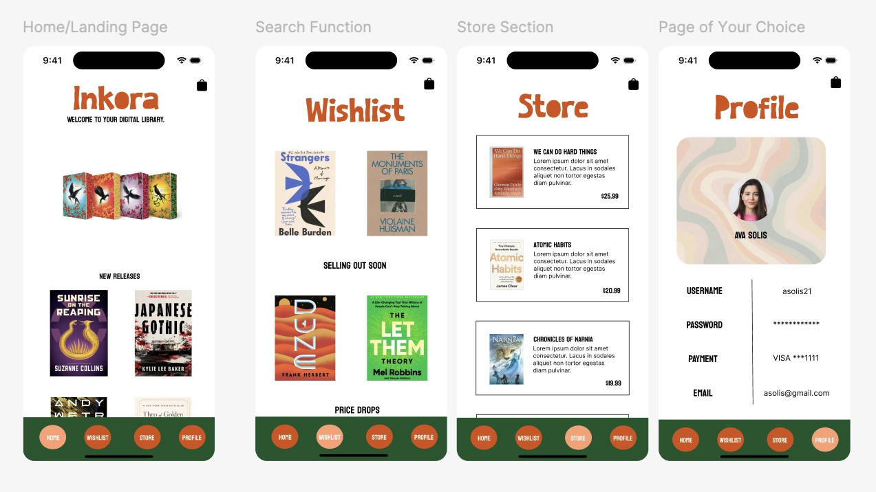
High Fidelity- Finished Look
The high fidelity designs represent the finished look of Inkora, bringing full color, real imagery, and final typography to each screen. Real book covers were added to the Home and Wishlist pages, the Store section displays actual titles and prices, and the Profile page reflects a complete user account setup. The warm color palette and bold navigation bar tie the entire experience together into a cohesive, polished product ready for user testing.